Appearance
Vuetify
Vuetify is a popular open-source UI component library for building web applications with Vue.js. It provides a set of pre-designed and pre-built UI components that can be easily used in Vue applications, including buttons, forms, grids, dialogs, icons, and more.
Vuetify follows Material Design principles, which is a design language developed by Google that focuses on a clean, modern, and intuitive user interface. The library is designed to be highly customizable and flexible, allowing developers to easily modify and extend the built-in components to suit their specific needs.
In addition to the UI components, Vuetify also includes features such as built-in theming, internationalization support, and accessibility compliance. It also provides a powerful grid system for laying out content in a responsive and mobile-friendly way.
Vuetify has a large and active community of developers, making it a popular choice for building web applications with Vue.js.
The Veutify website categorizes its web components into Containment, Navigation, Forms and Input Controls, Layouts, Data and Display, Feedback, Images and Icons, Pickers, Selection, Providers and Miscellaneous. Link
5 Commonly Used Vuetify Components
| Element | Description | More | Vuetify Link |
|---|---|---|---|
| Grids | You need a basic understanding of the 12 column grid and how it is used to manage layouts. You will need to know how to use v-row, v-col, cols to create a layout grid | link | Vuetify grid |
| Buttons | The v-btn component replaces the standard html button with a material design theme and a multitude of options. | link | Vuetify v-cards |
| Cards | Cards a used to organize content into a card base container. Cards can be used in varring degrees to organized content that include headers, icons, action rows and styling. | link | Vuetify v-cards |
| Tabs | The v-tabs component is used for hiding content behind a selectable item. This can also be used as a pseudo-navigation for a page, where the tabs are links and the tab-items are the content. | link | Vuetify v-tabs |
| Lists | The v-list component is used to display information. It can contain an avatar, content, actions, subheaders and much more. Lists present content in a way that makes it easy to identify a specific item in a collection. They provide a consistent styling for organizing groups of text and images. | link | Vuetify v-list |
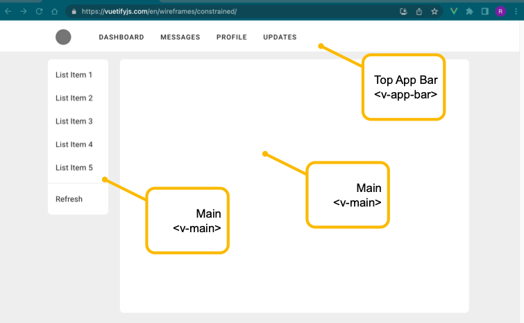
Layout Example 1 - From Vuetify Website

Layout Example 2 - From NFC Ora Vuetify Website
12 Column Grid Introduction
Material Design’s responsive layout grid adapts to screen size and orientation, ensuring consistency across layouts. Link